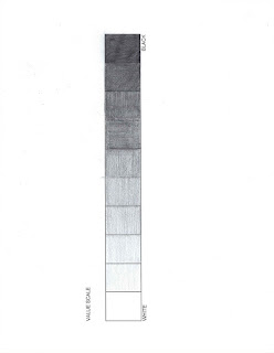
1. Discuss what you thought about creating the Value Scale and Color Wheel.
2. Which media did you enjoy working with the best and why?
3. What was the most important discovery in the creation of these studies?
4. What is the most important information you learned from watching the videos for this project? What is your opinion of the videos?
The value scale and the color wheel are very useful tools to help people understand the basic, but most important, foundations of art. The value scale is simpler in concept, but a monumental skill in creating visual imagery that has a 3D effect. The color wheel is more complex, but in my opinion the most fun of the two because you get to work with colors. I used acrylic paints as my choice of medium as I am most comfortable with them since they are very forgiving (on the artwork and the wallet).
I think the most important discovery from the exercise is understanding that color can have value. I had an old professor who once made us take a picture of a still life, then one of our painting, and turn both photographs black and white. It was truly eye opening to me to see a visual representation of what bright colors appeared “dark” in value. You can see a similar effect on the color wheel, with bright red having a darker value than primary yellow.
From the video Color Theory 2: Paint/Pigment Primary Colors. The Truth!!! I found it interesting that the “real” primary colors are considered Cyan Blue, Magenta, and Yellow. It actually makes the most sense, because when those colors mix it creates a pigment much closer to black than your typical primaries: red, blue, yellow. It reminded me of a printer, when you run out of black ink it will give you the option to use just the cyan, magenta, and yellow, and if you are printing a word document, the difference tends to be minor.


Comments
Post a Comment